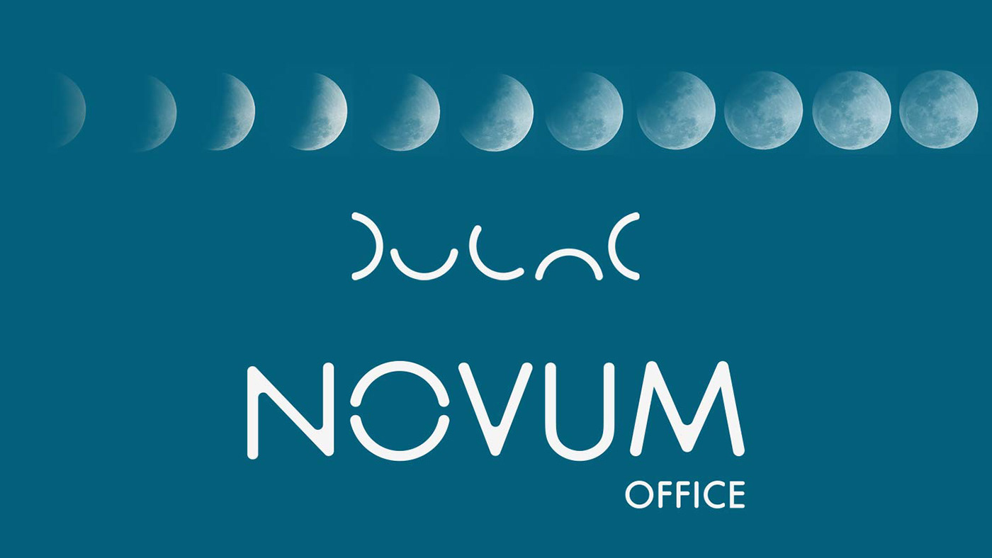
From the very beginning I knew that Novum Office was a status quo challenging business. First thought I had was "Novum Office is the night of the day". That’s how I came up with the concept where the colours and the look felt like a summer night.
I created a moon feel logo, making the O build and symbolising a full moon. The curvy font helped to give a modern look, to reflect the new way of doing business that Novum stands for. I used the moon phase imagotype to create patterns and use it as guidance throughout the brand.


